Multiple orders,
one strip, zero digging.
Order biryani for the house and bananas from Instamart, and Swiggy's home screen only tells you about one of them. A small concept that teaches the order-status strip to carry every active order, without costing a single extra pixel.
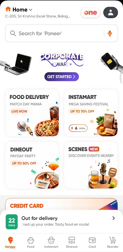
The strip only has room for one order
Swiggy pins a live status strip above the tab bar: the ETA, the order state, the rider's latest move. It's a lovely piece of UI, right up until you have two orders running at once.
Food plus Instamart in the same hour is a completely normal evening. But the strip shows a single order, and every other one hides behind a tap into the orders page. The information exists; the surface just never learned to share.
Two obvious answers, both with a catch
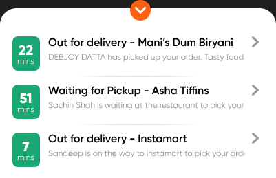
Stacked cards
Tap the strip and it expands into a stack of every active order, with a chevron to tuck it away. Everything visible at once, but the stack climbs over the content above it, and a three-order evening buries half the screen.
Horizontal swipe
Keep the single row and swipe sideways between orders, with dots for orientation. Clean and compact, but completely invisible: nothing tells you a second order lives one swipe away, so most people would never find it.

The strip takes the tour itself
The final pass keeps the single-row footprint and adds the one thing both iterations lacked: motion that does the discovering for you. The strip gently cycles through active orders on its own, dots show how many are running, and long rider updates glide past like a ticker. Swipe if you're impatient. Wait if you're not.
Live rebuild of the final interaction. It cycles on its own, exactly like the concept: no gesture to discover, nothing to learn.
The motion, end to end
Then Swiggy shipped it
Swiggy shipped the feature very close to the concept I had worked on earlier. Seeing your ideas made real by companies is such a validating feeling.
No credit claimed: they solved their own problem with their own team. But the quiet validation stands. The itch was real, the reading of it was right, and the answer landed close to where a billion-order product landed too.