From flat to functional:
Vetnio's landing page, revamped.
Vetnio's AI copilot writes clinical notes for veterinarians while they work, but its landing page wasn't telling that story. Flat hierarchy, buried features, zero social proof. Two weeks to rebuild the narrative and ship it, from audit all the way to a live, responsive site anyone can open.
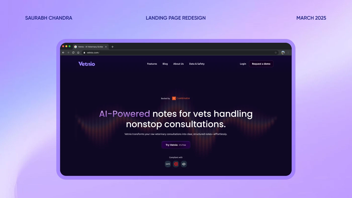
Meet Vetnio
Vetnio has built an AI copilot that records consultations and writes the clinical notes, saving veterinarians and clinics time, money and headaches. It helps with diagnostics, follow-ups and invoice generation too, reducing missed revenue while keeping the care where it belongs: on the animals.
As part of my 10KDesigners assignment, I was asked to redesign their landing page. The goal: stronger information hierarchy, smoother content flow, and a more engaging, modern experience that matches Vetnio's mission of simplifying medical documentation through AI.
What wasn't working
Before moving a single pixel I walked the existing page like a first-time visitor would, and wrote down every place it lost me.
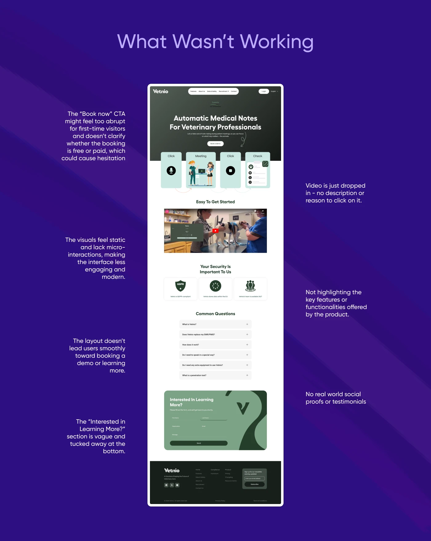
“Book a demo” feels abrupt for first-time visitors, and never says whether booking is free or paid, which invites hesitation.
Dropped into the page with no description and no reason to click it.
The product's key features and functionality are never actually highlighted.
No micro-interactions anywhere, so the interface reads less engaging and less modern than the product deserves.
The layout never leads visitors toward booking a demo or learning more.
Not a single real-world testimonial or piece of social proof on the page.
“Interested in learning more?” is vague, and tucked where nobody arrives.
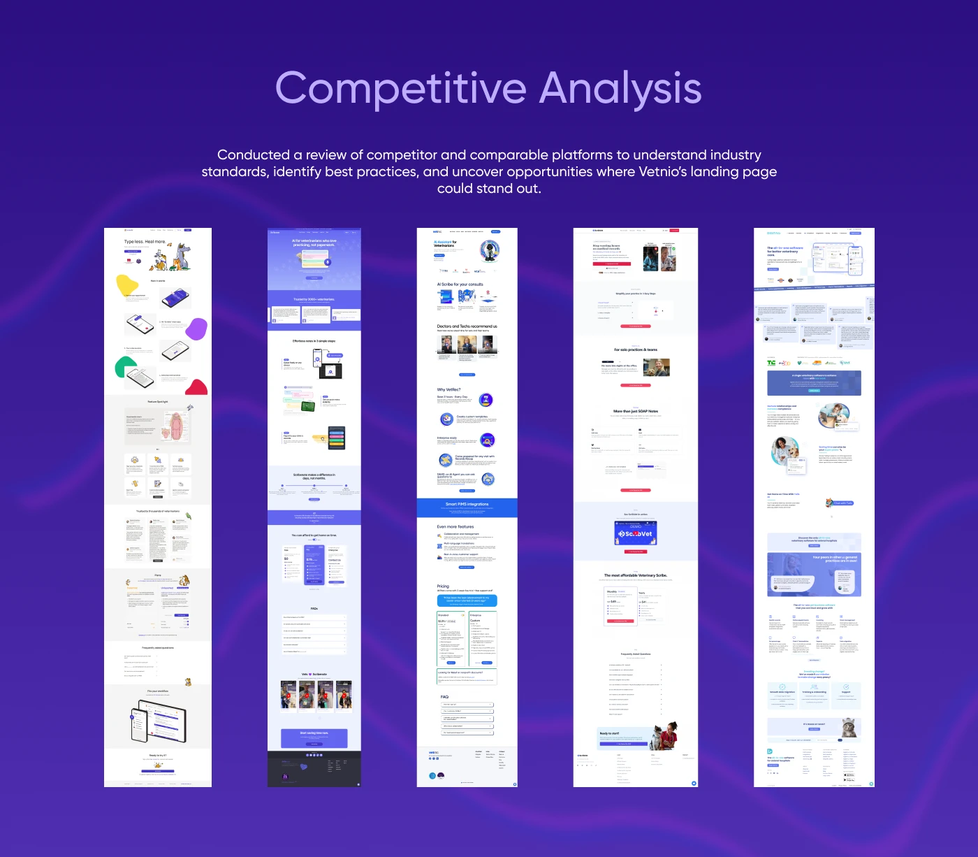
Reading the competition
I reviewed competitor and comparable platforms (other veterinary scribes and AI note-takers) to understand industry standards, identify best practices, and find the gaps where Vetnio's landing page could genuinely stand out.
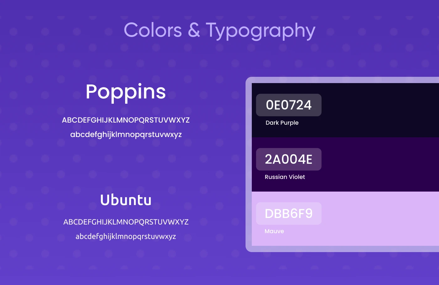
A system in Vetnio purple
The system stays loyal to the product's own brand: Poppins doing the talking, Ubuntu on display duty, and a three-step ramp of purples. Near-black Dark Purple, deep Russian Violet, and a luminous Mauve that carries every accent. This page you're reading borrows the same wardrobe.
From flat to functional
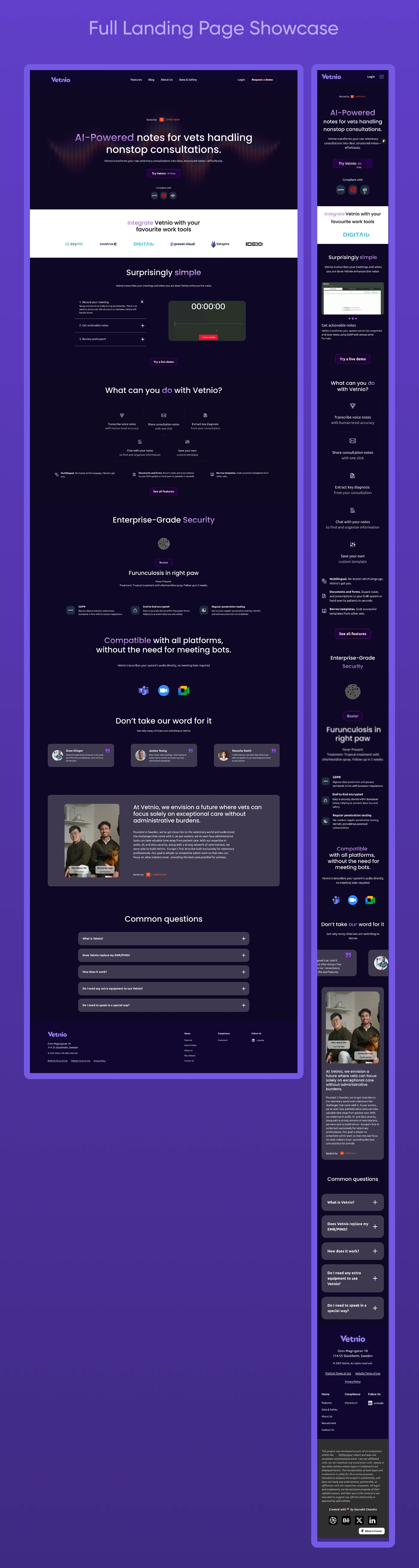
The new page opens with the value, not the ask: “AI-powered notes for vets handling nonstop consultations.” From there every section earns the next scroll: an integrations strip, a three-step “Surprisingly simple” walkthrough, a real feature grid, enterprise-grade security, and proof from the people who use it, all steering toward one clear action.
I didn't stop at the mockup
A redesign that lives only in Figma is a suggestion. So I rebuilt the whole page in Framer and shipped it: responsive from desktop down to mobile, carrying the micro-interactions the audit said were missing, with every CTA wired to a real destination. What follows isn't a screenshot. It's the actual site, running live.
What the revamp taught me
- Lead with the value, not the ask: a CTA lands only after the page has earned it.
- Proof is a design material: testimonials, backers and the founders' story do work no gradient can.
- Hierarchy is a route, not a style: every section should hand the reader to the next one.
- Carrying the design from audit to a live Framer build kept every decision honest.